Monday, April 21, 2008

Vast Continued

Okay, so when I said pages 3-4 were almost done I was totally lying. I went in the next morning and it was totally wrong. For one, I realized that her head looked like it was blowing off when in fact she was supposed to look like she was just floating peacefully, albeit dead. I also went in and made her body smaller because I felt the scale would be more effective. This was all spurred on by critical but kind words from by studio mates. Thanks guys! It looks so much better now.

The mock up pages the image is based on:


The (hopefully) final version, except for the text. I still have to decide how I'm going to adhere the text and whether or not I want to work into the vellum and text a little or if I want a border or what. I'll see what people say at crit, I guess.


Sleep

Vast

"It wasn’t ever going to stop raining because Day-oos was angry and she was going to drown but what better way to go? She saw it clearly. Her little body floating upside down in a vast green sea. It was too late to make a raft, too late to apologize or pray. But she was naked as the day she was born and was slippery with Day-oos’ wet earth."

Pages 3-4 are basically finished. Perhaps a few more final touches, but it looks like if I work pretty hardcore for the next week, I can get two pages done a day.


Finally, how I do the text:

First, I format it on the computer. It took me a while, but I finally decided on Adobe Jensen Pro for my font. Then, I upload the files (which I do in Photoshop, which I know is a more annoying way, but it's the way I know and it works so leave it) into the school's lasercutter Illustrator template. The laser cutter etches the text into the plexiglass. It looks like this, only less blurry:


Then I smear some Charbonnel Etching Ink (it's oil based, unlike screen printing ink which is water based) over the entire thing until its all in the letters. I wipe it clean so only the letters have ink on them:


Then I place the plate on the etching press, which looks similar to this:


Then I take the vellum, which all this time has been soaking in water (for at least half an hour) and smooth it over the plate. I smooth the felt on the press over the plate and the vellum and then roll. Once I've rolled over the plate once, I remove the felt and peel off the vellum, which now looks like this:


Yes, it's a hell of a process, but I think it's totally worth it. The text is slightly embossed, it's a little more inky than it would have been if I had simply printed, and it smells like ink, which I just love. There's nothing like getting high off your art. I also love the smeared, rubbed quality that is in some places on the text where I didn't rub the ink away quite enough. One of the ideas behind the execution of this book is tactile. Everything except for the etching is done by hand.

Ugh. First day of final crits is tomorrow. A week and a half left of school.

Sunday, April 20, 2008

OMG! OMFG!!

Real book pages, people! I am on a roll, folks. First off, my plexiglass laser etched text on vellum worked out REALLY well. I was so nervous, but it came out fracking beautiful. My main goal before the end of the semester is to get the rest of the text cut and inked. Anyway, I've gotten pages 1-2 done and have taped down and done the first layer on pages 3-4. I plan on having pages 1-2, 3-4, 5-6, 9-10, 11-12, and 21-22 done for final crit. Yes, it's a lot but my crit isn't until a week from Wednesday so I've got time. Plus the water color paintings really don't take that long because I already know what I'm doing mostly. If I can get all of the rest of the text cut out next week then I can ink them next Saturday, too. Plus then I'll have half my pages done, which will be pretty cool. Anyway, here's pages 1-2. For the love of all that is holy, please click on the images to see bigger versions. They are painfully small on the screen if you don't.

The original mock up pages on 8 1/2 x 11 inch computer paper:


The full pages with text on 22 x 30 inch Arches 140 lb watercolor paper:


Individual pages:


Phew! Bon soir. A bientôt.

Friday, April 18, 2008

TWO MORE WEEKS, PEOPLE

Working on my brother's wedding invitations. It's so much fun! I took a stamp I bought at Michael's and stamped it in sepia brown ink on all the cards and I'm going in and doing watercolor washes and detail in each of them. Also, I love stamps! I think I'm going to really get into this sort of stationary this summer and try to sell card sets on Etsy and see if anyone else needs wedding invitations, etc. It would be nice to bring in a little cash considering that tickets to England are all OVER 1,000 DOLLARS. What? Yes. Ridiculousness. Because it's not like I'm going to have to spend another 500 once I get over there or anything because they are in the opposite of a recession.

Also of note:
1) SCHOOL SUCKS.
2) I am 21 now. Bow to my supreme adult status! Sadly, no one has yet carded me. It was kind of anticlimactic.
3) I am transferring for realz now. Suck it UIUC! Oh, sorry Mom. That was too negative. Anyway, one more semester of school and then I am out, yo. A good year and a half of working a real job and then hopefully RISD.
4) I need a break from oil painting. Did you know that oil paint smells bad and is kind of messy?
5) I am getting a new camera with birthday money! I'm leaning toward the Canon G9: 12.1 megapixels and a 6x zoom. Paul says it's sexy, but that kind of actually made me want it less. I think he wants me to get it so he can play around with it. We'll see. I'm going responsible buyer shopping with my dad in a couple of weeks. I want it before I go to LA to pick up Vanessa.
6) Vanessa and Maddi are going to live with me this summer. Vanessa and I are driving back from LA. Road trip!
7) My summer is going to be ridiculous.

Wednesday, April 2, 2008

Creepy Baby Alert!


When I began this painting, I didn't intend for the baby to look so creepy. But things like this just happen to me. He's really meaty, too. When Jordan saw it, he said, "Now that baby has been drinking his milk! Hahaha!" It was obviously hilarious. It's a good thing Joan's a warrior, because you have to be frickin' warrior to carry that thing. Such a huge head, too. I'm thinking of making it all pale and veiny. I find creepiness, particularly in my own paintings, amusing. I suspect loads of other people just find it creepy, but oh well. At least I can amuse myself.

In other news: new layers on the face and hair!


I'm pleased. I really wish I'd figured out the thick paint/impasto thing earlier. I love the texture on her face. I'm SO glad I did it. Hooray for risks with positive results!

Dead tired now. Sleep.

Monday, March 31, 2008

Wrapped Up In a Book

Okay. So. New mock up pages. Now my task is to a) do several large page versions and b)get some of those printmaking collages done. This would all be a good deal easier if the printmaking lab was open more than three days a week for four hours at a time, but there you have it. I was also disappointed today because I was going to get some stuff cut at the laser cutter today only to find that it didn't start up until noon and I had class at one and it takes a bloody half an hour to set the thing up anyway so chances are I would have been late or whatever. I dunno. I've not skipped that class yet, so maybe I'll skip it on Wednesday and just get all the laser cutting done in one go and get loads of prints done on Wednesday.

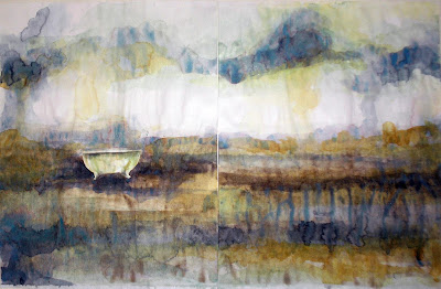
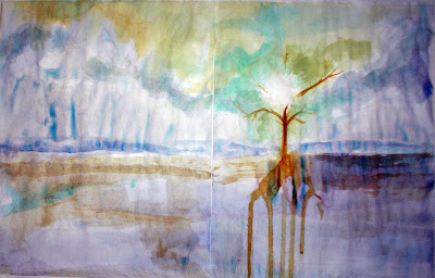
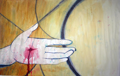
When I was thinking about imagery for my book, I had to take many things into consideration. There was the easy route of just literally illustrating what I had written, but given the flow and fluidity of the text, this seemed like a very bad idea. It wouldn't go at all. Rather, I've decided to create an atmosphere. The atmosphere consists of a loosely painted background, perhaps a landscape or a surface of some sort. Then, within this loose painting there is a moment of clarity. An object which stands out amongst the washes of color in hard edges and crisp lines and declares its specificity. I chose objects that stood out in the text for me and were important to me. Granted, not all of the text follows this philosophy. I decided that when the main character, Verity, is indoors, she wouldn't be in those vast washes of color any longer. Rather, inside everything would feel much more concrete and she would be so close to it that the objects that were one clear and far away were now right up into her face to the point where they almost become abstract. Often they do become abstract. Pages 9-10 are an example of this. Anyhoo, here are the pages that I am satisfied with and can see going on to become large. There were loads that did not pass muster, but I think so far I have 12 out of 24 pages figured out. I'm halfway there, so it's not all bad.


pages 1-2


pages 3-4


pages 5-6


pages 9-10


pages 11-12


pages 21-22


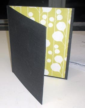
Horrid, horrid bubbly book case. I guess at least you can see my color scheme and the lining paper I'm planning on using, though. This is all only 8"x10", too. It's really freaky to keep reminding myself that it's eventually going to be 22"x30". Ridiculous.


Basically at the midterm critique was that they had trouble translating everything into something with a final form, so they wanted me to make some big pages so they can see how I envision the final product. I'm getting started on that next. I can't believe there is only four weeks left in the semester. Insanity. So much to do. Ugh.

listening to: Sufjan Sufjan Sufjan

Sunday, March 30, 2008

Production

I am officially awesome. I was super productive today. AND the Joan of Arc painting is finally going somewhere. I can see the end in sight, folks.


Outline of the figure.


Filled in and somewhat painted face of figure. I wasn't terribly happy with where the skintone was going, though.


See? Totally gross. She looks all bruised up, which given the armor fits I suppose, but still not what I was hoping for. I wanted her to glow.


So then I did something drastic. I'd been looking at impasto in old master paintings and I really wanted to use it, but I wasn't exactly sure how. So basically I mixed a few pink skin tones together, didn't add medium so it's just thick paint and went to town. Right now both she and her child look like a lobster, so I turned the canvas toward the wall so no one could see it until it was done drying. It wasn't totally dry for like, two weeks. It was intense.


Finally, here's what I did today. It's defiantly going somewhere. I think a couple more layers on the face and she will glow. Huzzah! I really don't want to do that baby, though. Blug. I guess I should do a layer on him before I do anything else on the painting. *sigh*

Friday, March 28, 2008

Midterms Over

Phew! I got quite a bit done this week. I haven't pictures of the mock up pages on me, but I'll take some tomorrow when I go to studio. Tomorrow I'm stretching and gessoing loads of smaller canvases as well as trying to make my Joan the Mother painting pretty again. It's SO ugly right now, but it's only because I'm trying to build up a layer of impasto. I showed it to Ros and she got a bit excited and said she knew it was going places, so hopefully I'll be able to live up to her expectations. If I do something nice with it tomorrow I'll post some before and after pics. If not, I'll cry.

Anyway, here's the final version of the architectural painting I did for Ros's class. It's like, 6' by 2.75'. Everyone thought it looked like a sheet of reflective metal, which is cool but totally unintentional. Anyway, I love oil painting and will obviously continue, but I think it's going to be more of a side project for me. My real focus will be books.


listening to: She & Him -- Volume One

Wednesday, March 19, 2008

Research

So now that I've decided I want to go into illustrating, I've been doing some research on illustration work that interests me.

Paula Sanz Caballero:


Really cool style. She appears to work almost entirely with textiles by hand. Even though they are stylized, her pieces also contain depth and she creates little worlds with fabric and thread.

Kenneth Lavallee:


I love the graphic, vintage playfulness of his style.

Jillian Tamaki:


Probably my favorite so far. Her style is so cool! It's reminiscent of Japanese Ukiyo-e prints, but it also has a hint of Americana to it. She's also doing graphic novels (the above, Skim). She didn't write it, but it's still a bit closer to where I'm headed than all the magazine work I keep running into. I mean, I'm certainly not above taking a magazine job. I just hope that that doesn't become the highest point of my career.

Anyway, it's really amazing. I've been spending so much time trying to find painters that create compelling work and it turns out all I had to do was look up illustrators instead. This is just the tip of the iceberg. I'm defiantly going to check out that graphic novel, too.

More mock up pages soon. I've done four more and have to get 16 more out by Wednesday at 8:30, so there's going to be a lot at once.

Friday, March 7, 2008

Frack you, UIUC

©Alison Shaw

Blerg. What a gross day. So they posted course schedules for next semester and it turns out that the studio class I really wanted to take are scheduled at totally impossible times. For example, Ninth Letter, the class that is all about the literary arts magazine here where the students basically illustrate a story or essay and which sounds so up my alley is from 9-11:40 Monday/Wednesday. Guess what else is at that time? My mandatory and one section only studio class. So I emailed the teacher in charge all "Wtf??" and she was all, "we didn't mean to exclude studio majors, it was just the best time to meet with the creative writing people". So basically I cannot take the class. At all. Which sucks. A lot. Because there is no book arts any more because Bea is leaving and the University couldn't give a crap about it so they're not hiring anyone new in that field. Printmaking is barely available, and not available at all next semester. They're just totally getting rid of any technical/crafts classes that don't have anything to do with design. This really pisses me off because I'm honestly pretty bored by conceptual art and like more tactile art than graphics classes. So I was really annoyed for a while that I was going to have to just take random studio classes that would have nothing to do with what I'm planning to do in the future because the University is going in a different direction from me when I realized that I need to do more. So I checked out RISD's site to see what they offered aside from just a studio art major because I'm sick of listening to blowhards say blowhard-y things during crits and I found out that they don't offer a master's degree in illustration, but they do offer a bachelor's degree in illustration. So I'm going to do it. I'm going to get a second degree in illustration at RISD. They have so many amazing classes like, Watercolor: Intro to Medium, Printmaking Techniques for Illustrators, The Magic of Books, Picture and Word, Master Painting Techniques, and The Collaged Image. Basically it looks fawesome. I talked to my mom and she said a lot of my stuff should transfer (hopefully) so I could get to the good stuff right away and it would only take 2-3 years. Then I could start a career as an illustrator and work my way up until I'm writing and illustrating my own books and novels. I mos def want to get into kid's books, too. I've been looking up loads of children's illustrators and the poor kids are getting crap these days. I mean, seriously, what the frack is junk like this:


Just cause they're a kid doesn't mean they wanna look at cartoony crap. There's so much gross cgi stuff and junk that anyone cranks out. I want to bring real beauty and depth and humor (sometimes, not in my current project) back to illustrated books. Those are the books I still love to this day. I've decided I don't want to be a gallery artist. That seems dull to me. All the making paintings about the same thing over and over is just blah.

Speaking of paintings, I have a new favorite artist. His name is Odd Nerdrum and he is a weirdo that I would never want to meet but LORD can he paint. I found this GIANT book with like, a bagillion of his paintings + details called Themes at the library and I've been scouring it, often with other painting people, ever since. I think the other day Jordan and Paul and I look at it for like, an hour. It's that cool.

Some of his work:


Girl with Red Hair detail


Bathing Icelandic detail


The Kiss


Barter Detail


Boy with Twig


Return to the Sun


White Summer Portrait


White Summer Portrait detail


Woman with Child (haha! That baby's head totally cracks me up!)


Profile

Glah!!! There are so many things I want to do, but I feel like I have to teach myself everything!

I have to go to RISD. I just have to.