Showing posts with label literature. Show all posts

Friday, November 9, 2012

Barn Burning 2: The Burnaning

    I have a few larger independent projects going on this semester. This is great, as am I am learning how to balance the workload for these along with the smaller stuff that is due week by week. I'm also way more invested in my work. It feels like a culmination of everything I've been working toward for the last couple of years.
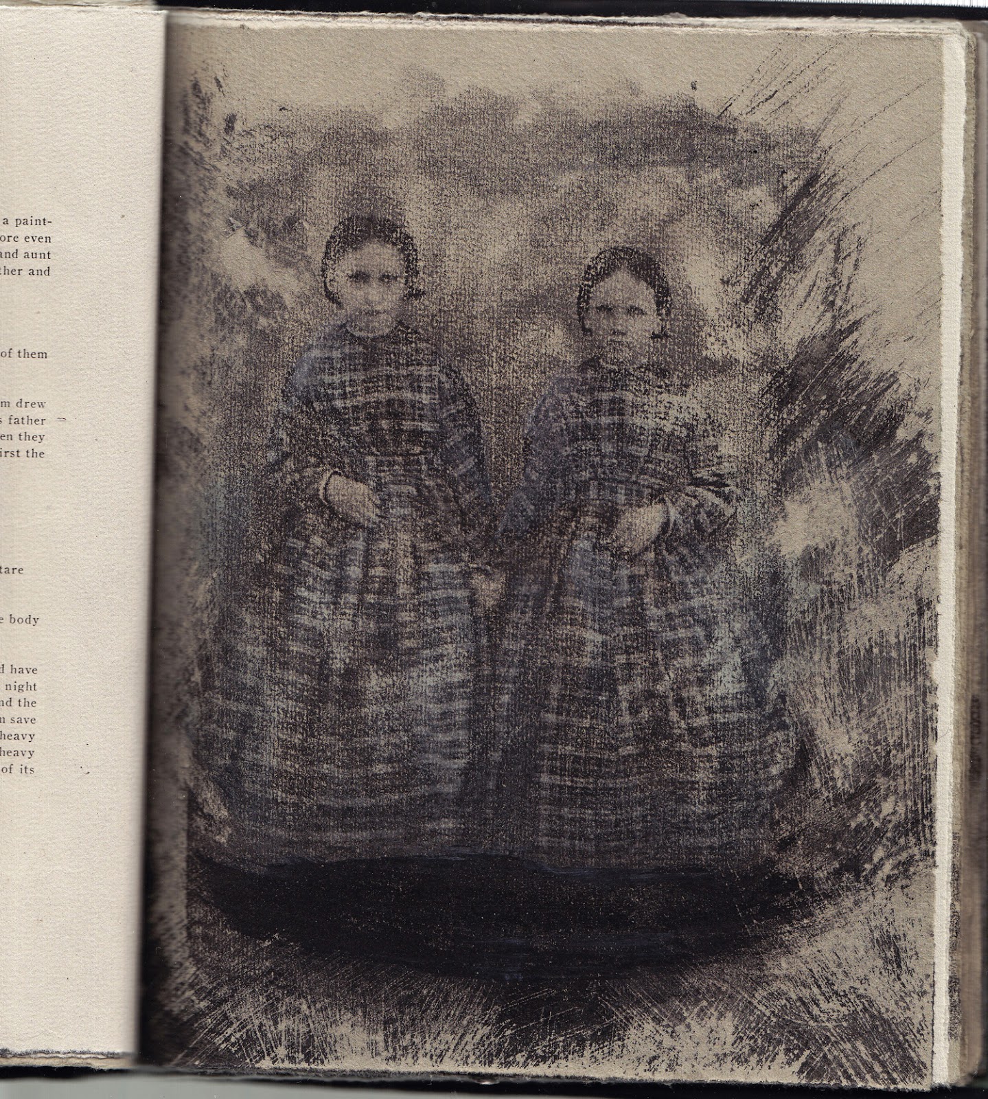
       The most gargantuan of these is an artist's book of William Faulkner's short story Barn Burning. This story has been on my radar since 2007 when I read it for a modernist literature class. I'd already read a bunch of Faulkner's work, but this story stood out as it takes the themes of class in a postbellum and post industrial revolution south and explores them fully in a condensed fashion completely from the point of view of a seven year old boy in a sharecropper family. The father is a terrorist who, when he feels wronged by the landowners, will set fire to their barns. The boy is torn between the loyalty he feels to his father and the unhappiness he feels from being despised by the general population and from being constantly and violently uprooted. Though they are more in the background, there are also themes of race and gender which I am trying to explore more through imagery.
       So where does one start with 22 pages of text? Well, last fall I made an experimental mock up of this book for my advanced drawing class. Initially, it was going to be a one off, but as I grew more engrossed in the text and the way I made images for it as well as the book making process itself, I realized that this was just the beginning. This was a great project because I was able to experiment with using old photographs and chemicals and leafing in my drawing process. Most of all, it was fun. Often, drafting is the most painful part of the image making process for me, and this book was not about drafting images. It was about printmaking and layering and taking away and layering again and making my studio smell like wintergreen solution and bleach.


Barn Burning Mock Up, 2011


       This is what I began with this semester.  My goal with the next version was to incorporate the text into the imagery, create drawings to go along with the prints that I was doing, as well as create visual flow through the story.  I will be updating more soon with how the process is going.  I've been learning a lot, like that books have a lot of components and that they take a huge amount of planning.  Also to remember to scan the pages before I bind the book.  

Sunday, August 19, 2012

Summertime

        Her mother washed her clothes in the old washer, which spat soap out of a long black tube and rumbled violently on the concrete. After she trudged outside with a pile of moist fabric in one of those five-dollar plastic baskets. Two gnarled poles jutted into the sky. They were connected by shoelaces knotted to shoelaces. Once the shoelaces had been pristine and white in crisp paper on crisp shoes with fresh rubber soles and a fresh leather smell. Now they frayed into their knots and swayed dully in the wind. Clothespins interrupted their drab horizon. Cotton and linen and poly blends hung and swung to and fro with the horizon and the breeze whispered through the holes in the weaves until the damp was blown away and what remained was dry and wrinkled. Clothes dried by the wind are permeated by it. They are duller no matter the detergent you use. 
        Today after her mother took her school uniform that she had dropped ketchup and mustard onto from a lunch full of condiment overestimations. She ventured outdoors in underwear alone and saw the pleated plaid skirt and sweater vest fluttering and dancing. She ran over in bare feet and briefs and stuck her nose into the damp. The cool must filled her and her little heart beat faster and she suddenly wanted it to rain. She gasped at a low rumble of thunder and felt wet on her cheek. The clothes grew heavy and slumped to the grass below. Her briefs clung to her body and she tugged them down her skinny legs. Her limbs slipped in the mud and drew her into a recently seeded field. There was no growth so she was flung into it. She kicked and splashed and squished. The thunder roared a giant lion roar and the rain fell harder and she felt she was so wet that she would never be dry again. 
        It wasn’t ever going to stop raining because Day-oos was angry and she was going to drown but what better way to go? She saw it clearly. Her little body floating upside down in a vast green sea. It was too late to make a raft, too late to apologize or pray. But she was naked as the day she was born and was slippery with Day-oos’ wet earth. 

This is the beginning of my final comic for my comics class this last semester based on a short piece of writing I've had floating around for a couple of years. Below is the corresponding writing. To churn out a lot of drawings fairly quickly, I worked with drybrush india ink on larger pieces of cold press watercolor paper. When it was working for me, I really enjoyed it, and it's a style that I want to explore more and feel that I'm just discovering.

Friday, March 19, 2010

Extra Super Awesomeness

A

while ago, I posted about Long Ago & Far Away. At the time, I couldn't really find any videos on the internet of it, and I kind of think I wouldn't have known how to embed them anyhow. I'm a little amazed, looking all the way back then, that this blog has been around for three years at this point. Anyway, I was looking back at those old videos again because my younger brother and I decided to watch an old paleontology program that we used to watch all the time when we were little. I randomly looked them up on youtube, and lo and behold, someone's posted quite a few of them, including one of my favorites, Svatohor.


There are three parts in all. It's a pretty intense stop animation. I think I get some of my creepy, aesthetic leanings from having watched these things. My mother said there was also a creepy french circus claymation one, but I have no memory of it. It is actually one of my aspirations to, at some point, do a stop animation with dolls and a set I have designed and made myself. Stop animations have such an interesting atmosphere to them that really adds to stories like this Russian folklore.

Of course, one of my other favorites was the phenomenally done Wind in the Willows.


This was also a stop animation, and it was terribly British in an awesome way. Of course, it features animals that are known only by what species they are (obviously there is not more than ONE Rat, Mole, Toad or Badger. These creatures simply appear and are only men for some reason). Mr. Toad is akin to a Bertie Wooster who hasn't a Jeeves, and Mole, Rat, and Badger are the straight men who smack him in the head from time to time. Like Svatohor, the stop animation lends a great atmosphere. Because a great deal of time was spent on these projects because they are stop animation, it often feels as though their worlds have more depth to them then a good deal of the cgi stuff coming out now. A prime example of this would be Tim Burton's latest version of Alice in Wonderland, which felt exceedingly one note, obvious, and flat to me. Like anything else (for example, mass manufacture over something hand done) there are pluses and minuses, and budget cuts and time saving leads to a loss of attention to detail and an obvious passion in the project.

Finally, I finished my RISD application a week or so ago. We were supposed to send in three drawings: one of a bicycle, one that used both sides of the paper, and one of something from three different perspectives. I am really hoping they haven't gotten any bicycle drawings quite like this yet:


I really like tea.

Saturday, February 13, 2010

Heh heh . . .

G

ood grief, I'm terrible. I suppose it's hard to get back into doing something when you haven't done it for awhile and your brain feels like mush a good deal of the time. At any rate, the least I can do is update with some images from my illustration class last semester as well as some new images from my most recent project, a reworking of the book I made a year or so ago, The Sheep Child, based on a poem by James Dickey. Given formatting issues I have when I try to put strange spaces in things in blogger, I won't even try to type it up, but you can read the full text here. I will more than likely go more into the challenges of illustrating such a thematically rich piece when I've finished, and the book will be available for purchase on Lulu, though I don't think I'm allowed to make any profit off it because I don't have rights to the poem.

Anyway, here is an illustration assignment from last semester. I was supposed to do a pencil drawing of a hand holding an object:


This piece was basically the first serious pencil drawing I'd done in a LONG time. It was nice to remember how to handle the medium, and that I can get some pretty rich results from it, though I think general use in future will be in mixed media pieces. I also got some water soluble pencils, so I'm a bit excited to experiment with those.

Next is a ink drawing of some mushrooms. the assignment was to do a full value drawing in ink of vegetables. Now, I discovered last semester that intricate full value pen and ink drawings are not my cup of tea, but I am glad that I know how to use them, I suppose. Again, such a technique will also probably only be used in a mixed media piece, but I quite like this piece because it only took a couple of hours and though it is full value pen and ink, it is a full value pen and ink that is true to my way of working, which is messy and fairly expressive but also given to moments of specificity and intricacy and detail. Or, at least, that is what I hope I achieve.


I have a few more, of course, but the size of the assignments is just outside the range of my scanner, and I have to piece them together, which is fecking annoying. I've been coveting a larger scanner for not a terrible price on Amazon, but I'll wait until I move to purchase most likely.

Here are the new pages for the book, though I'm posting the at the moment as is and without text because I'm still messing about with that stuff. I think they're both terrifying, but generally people I show them too disagree. Perhaps I've been spending to much time with the text as well as staring at them in the early hours of the morning. They are both a mixture of watercolor and gouache.


I'm only reworking 6 of the pages, and some are collages with old photos, and some are simply abstract paintings, so for the ones I was reworking I wanted to find a place in between the concrete imagery of the photos and the abstract backgrounds. That place is in these slightly stylized lambs and sheep in atmospheric settings.

If anyone randomly would like a high quality giclee print of any of these or any of my other images, please email me (spittingair@gmail.com) so we can chat!

Now I've got to finish one more page, and then its off to the publishers.

Friday, May 15, 2009

New Harry Potter Book Covers

Maybe? I hope so. I don't know about everyone else, but I've always felt the illustrations/covers of Harry Potter (the American Edition, don't know about the others) were just all right. Not really my style, I suppose. Examples:


They certainly look like children's books, which I suppose to an extent they are, at least the first couple. But really they have become a lot more than that, and each one grew in maturity and I wouldn't really recommend the last book to an eight year old. These new designs (which, as far as I can tell, were done for fun and are not going to be published) are classic, mature, and really just well done aesthetically.


I am iffy on the fifth one (Order of the Phoenix) because the image of the world in someone's hands is a cliche and this hasn't really added any twists to that. However, the seventh one (Deathly Hallows) is especially brilliant because it subtly introduces the concept the the idea that the seventh book hinged on, which was that everything at that point was polluted and controlled by the evil doers (Voldemort). I also enjoy the sixth one (Half-Blood Prince) because can totally see that scene in the book. Overall, I would say these would be a nice change of pace to the children's illustrations that seem to be de facto for Harry Potter covers. You can see them in their home environment here.

Thursday, November 20, 2008

More Adventures in Layout

We're going somewhere. Some more initial layout:


I'm thinking of using this for the final page:


I'm actually really getting into this. The computer allows the process to go a lot more quickly and I can work on it pretty much anywhere if I have the right files and images uploaded.

On another note, another childhood love I've been getting back into aside from Tintin is Ranma 1/2. I hadn't read the comics in a few years, so I forgot how completely ridiculous and fun it is. The basic premise is that Ranma is a teenage male martial artist whose accidentally gets knocked into a cursed spring while training in China. The spring has a tragic history of a woman drowning it in some 1000 years ago and now anyone who falls in turns into a girl when splashed by cold water. Hot water reverts them to their original form. So Ranma turns into a buxom red head every time he's hit with cold water. There are all sorts of springs, and throughout the series new characters who have fallen into springs of drowned cats, pigs, ducks, and yetis riding oxen while holding an eel in one hand and a crane in the other, pop up.


So anyway Ranma and his father go to live with his father's old friend Soun Tendo. The father's decide that Ranma will be engaged to Akane, Soun's youngest daughter. Both Ranma and Akane are vehemently against this and what follows are a bunch of action packed (mostly) silly stories. I'm one of those weird people who laughs out loud if I'm reading something funny, and I laugh a lot during Ranma. You can, if you so desire, read it all online for free here: The New Ranma 1/2 Project. It also has a lot of T&A. I'm not sure if it's normal to seem topless teenage girls running around all over the place in Japan, but this was apparently a series aimed at children. Anyway, if you're not offended by black and white line drawings of boobs, it's fun.

Tuesday, November 18, 2008

Layout


So I'm laying stuff out on the computer and I'm not terrifically over the top happy with anything yet. I think I need to do some more stuff by hand to scan in or something. It just feels kind of amateurish at the moment, although I do think the cover is pretty close. I've been working on that a lot and only just started on the pages, so I think it's a matter of just continuing to mess around with it. It's a process and given time constraints, the computer is really the best finalizing tool because I can undo with a click. I think I'm learning, too. The other plus is I can present several of them in crit and get feedback and then simply fix it on the computer. So perhaps in this experimental phase, this is best.

I got some more vintage photos that I ordered online from New Jersey this weekend. Some of them just give me the heebie jeebies! I'm pretty sure that some of the babies are dead in the photographs. It wouldn't be surprising as taking a photo of the recently deceased was a pretty common thing 90 or so years ago. It's pretty weird looking at all of these photos of random people from the the beginning of the 20th century knowing that they are either very old or very dead now. The photos all reek of another era. It's a strange atmosphere. Some stuff I've done with new ones:


Paul said the lower one looks like a vampire, which I am not going to argue with. I actually think it looks a little like Batboy:


Hee!